Anima Mortalis
I was tasked to create a logo for the melodic metal band "Anima Mortalis". They wanted to insert classic icons into the logo, but yet make it look like metal band logo. Unfortunalety the band decided to ask another designer for the work.
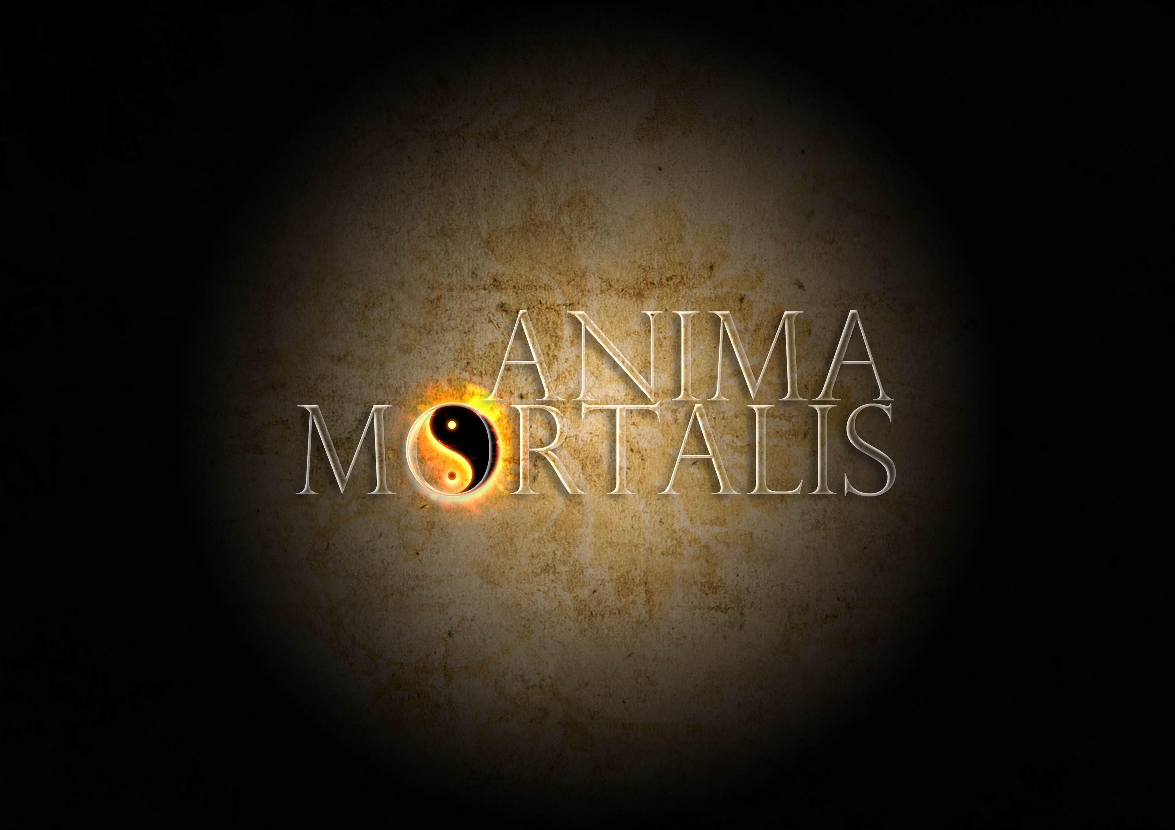
Version I
Version II
Version III
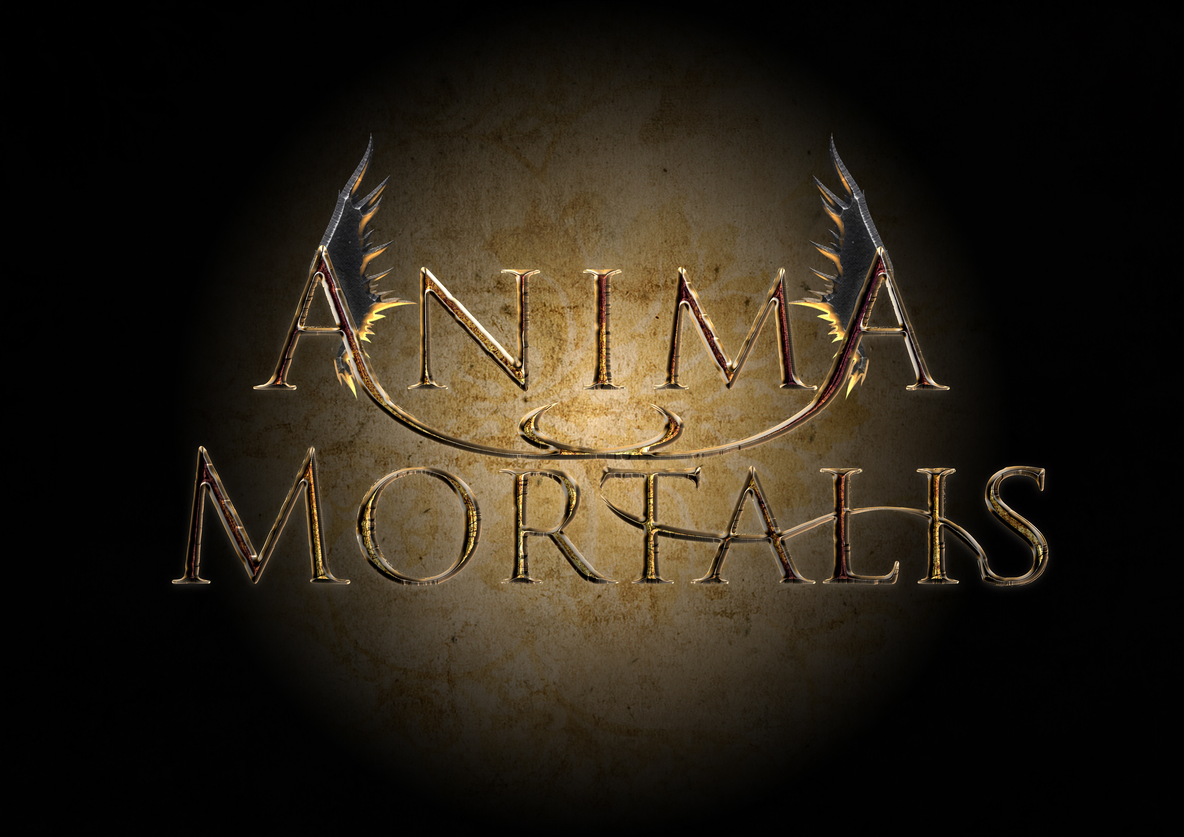
Version IV
I liked the idea with the ying-yang to equal the death and new beginning of life/soul.
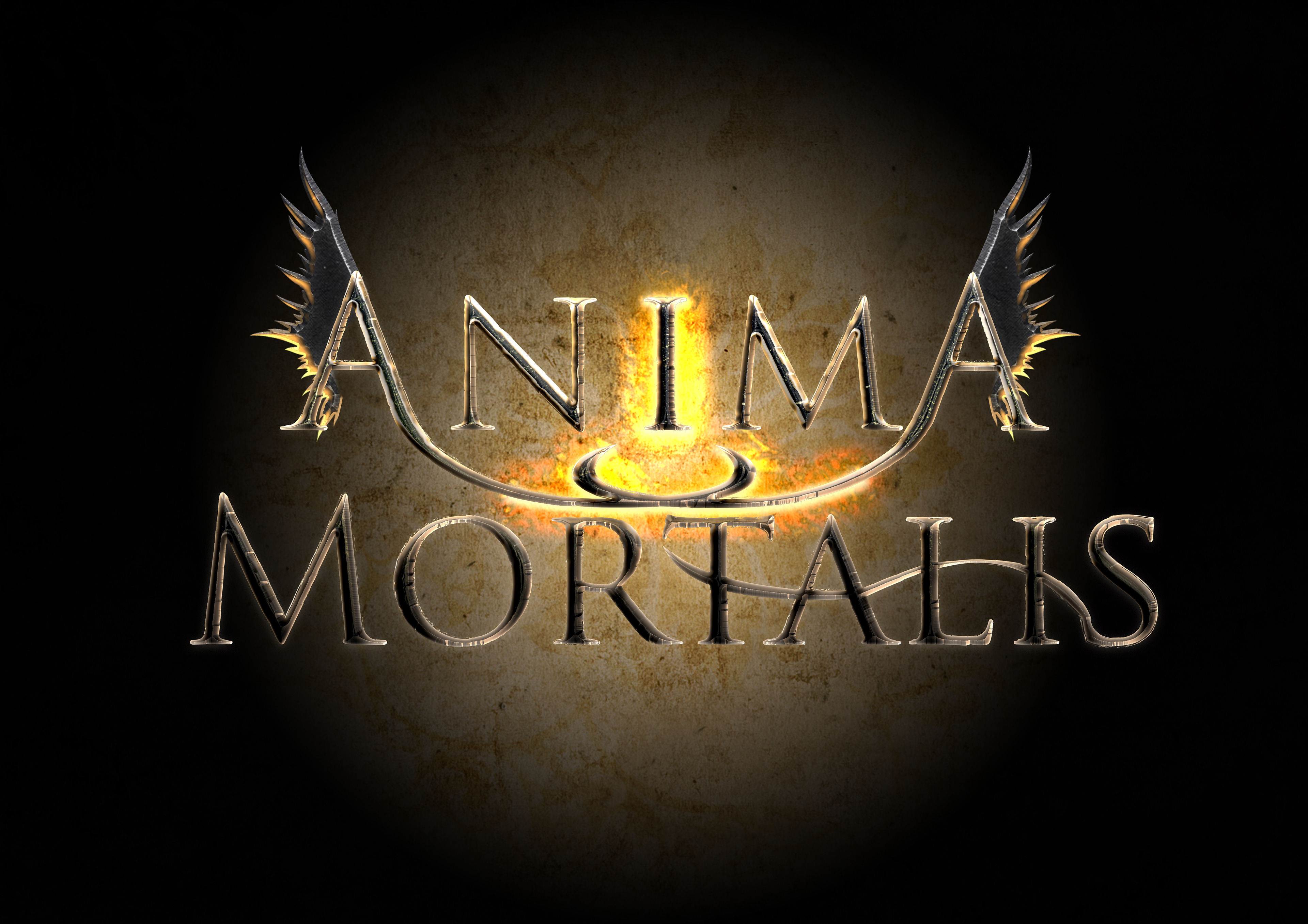
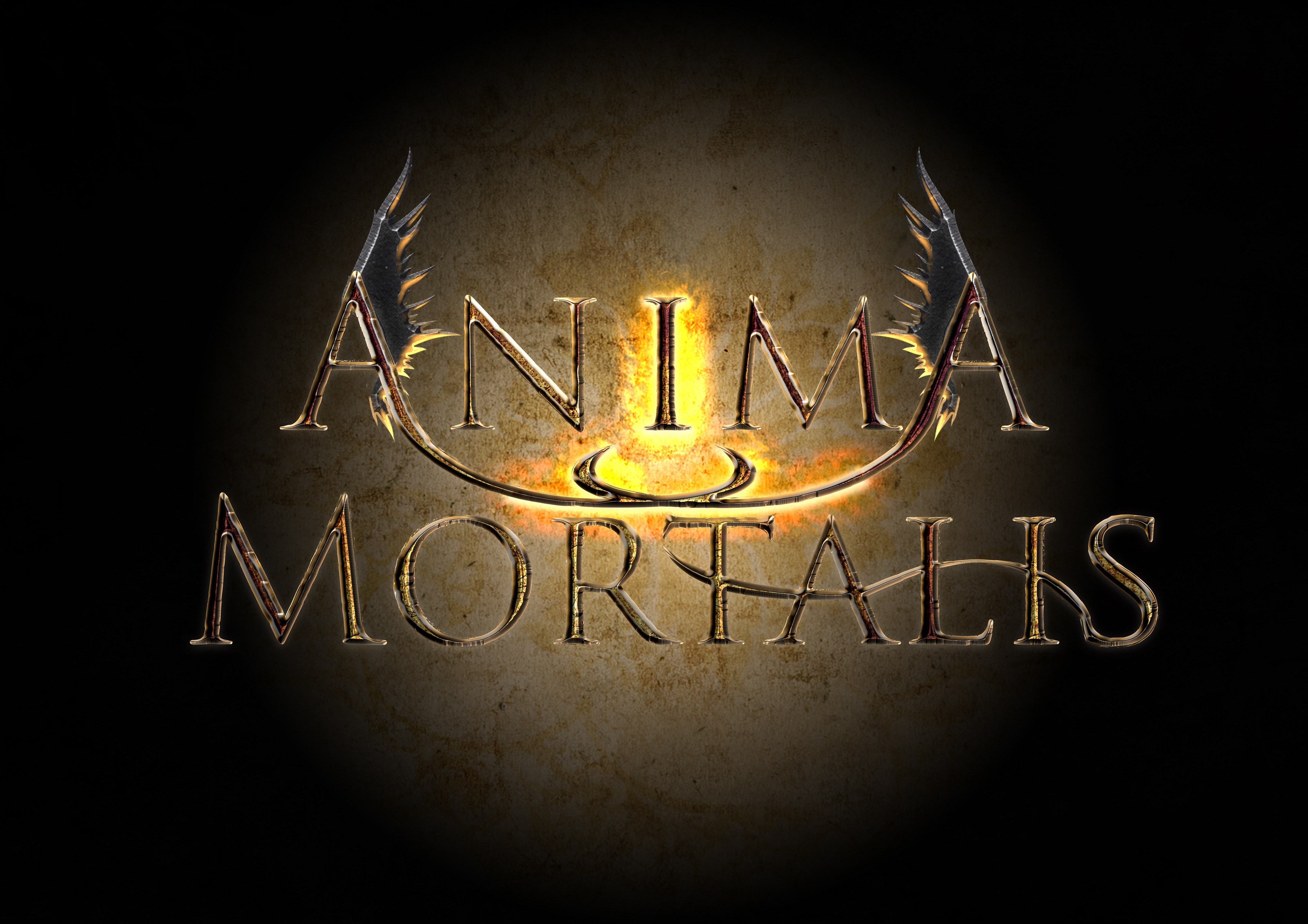
Version V
I like the angelic idea behind it, supported by the devil's horns. Both symbolizing good and evil. Classic stuff.
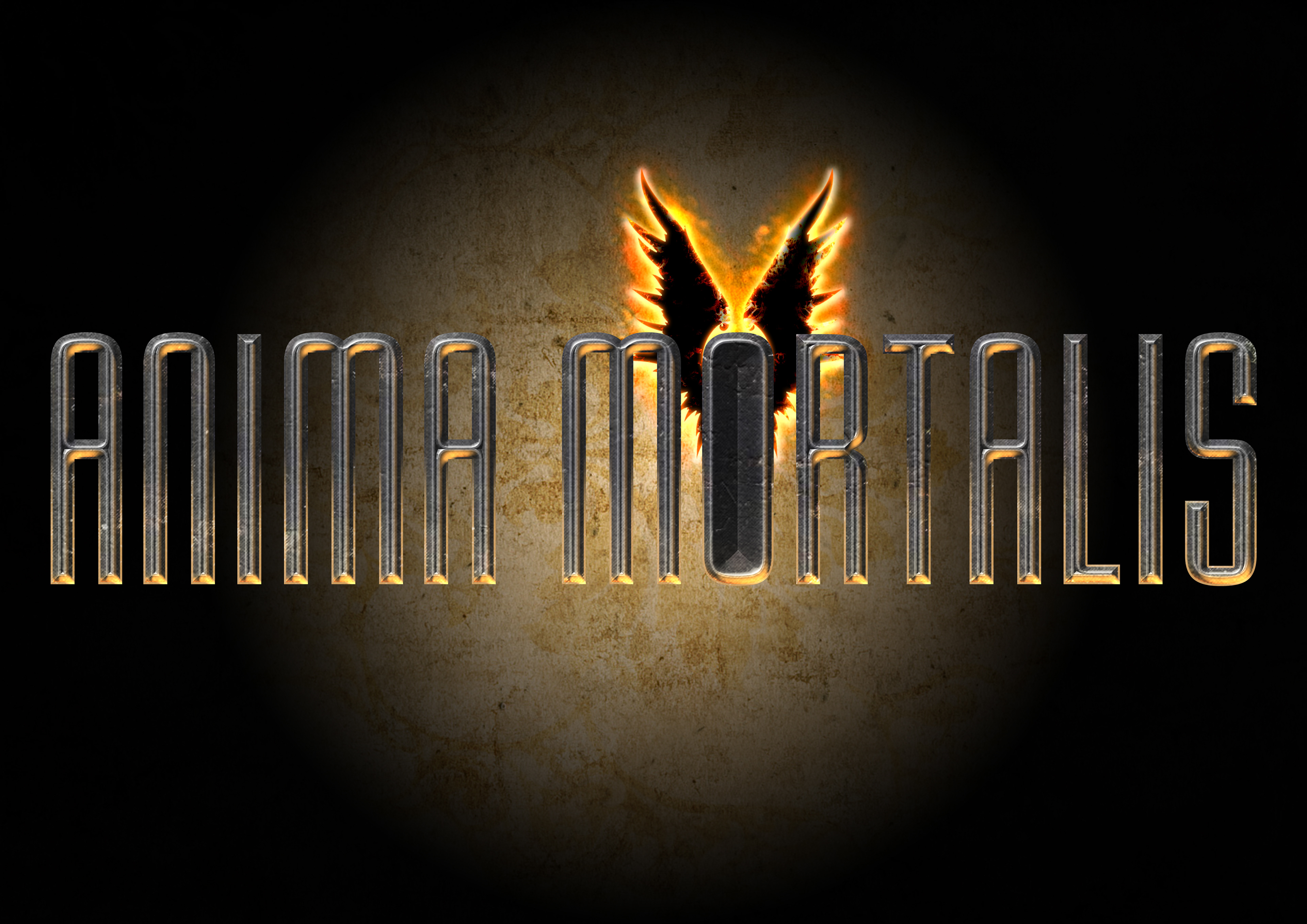
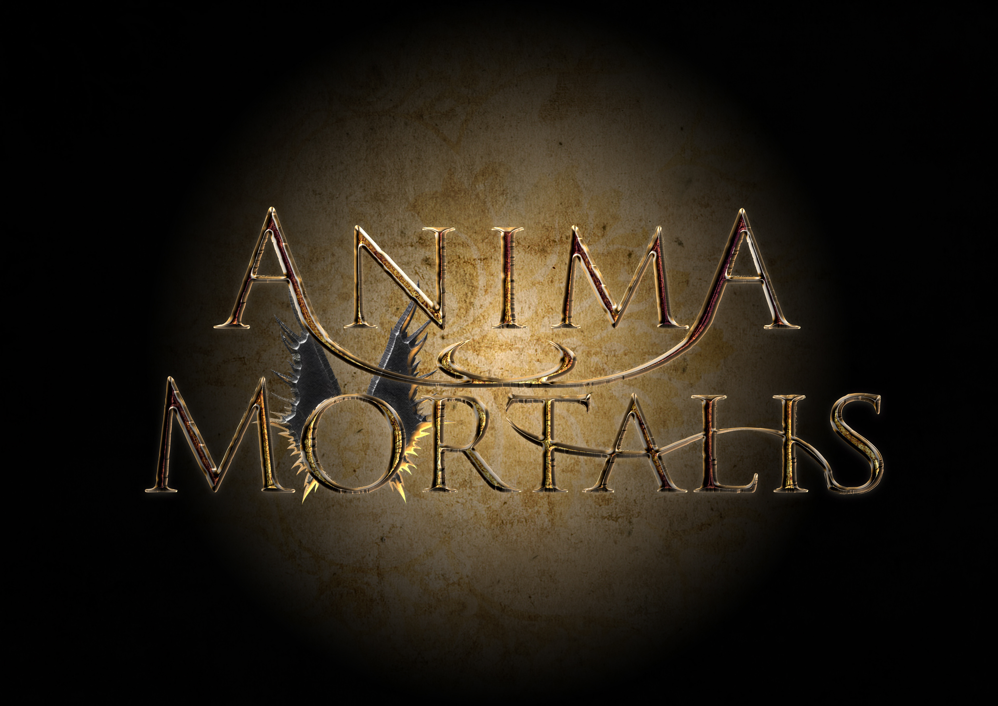
Version VI
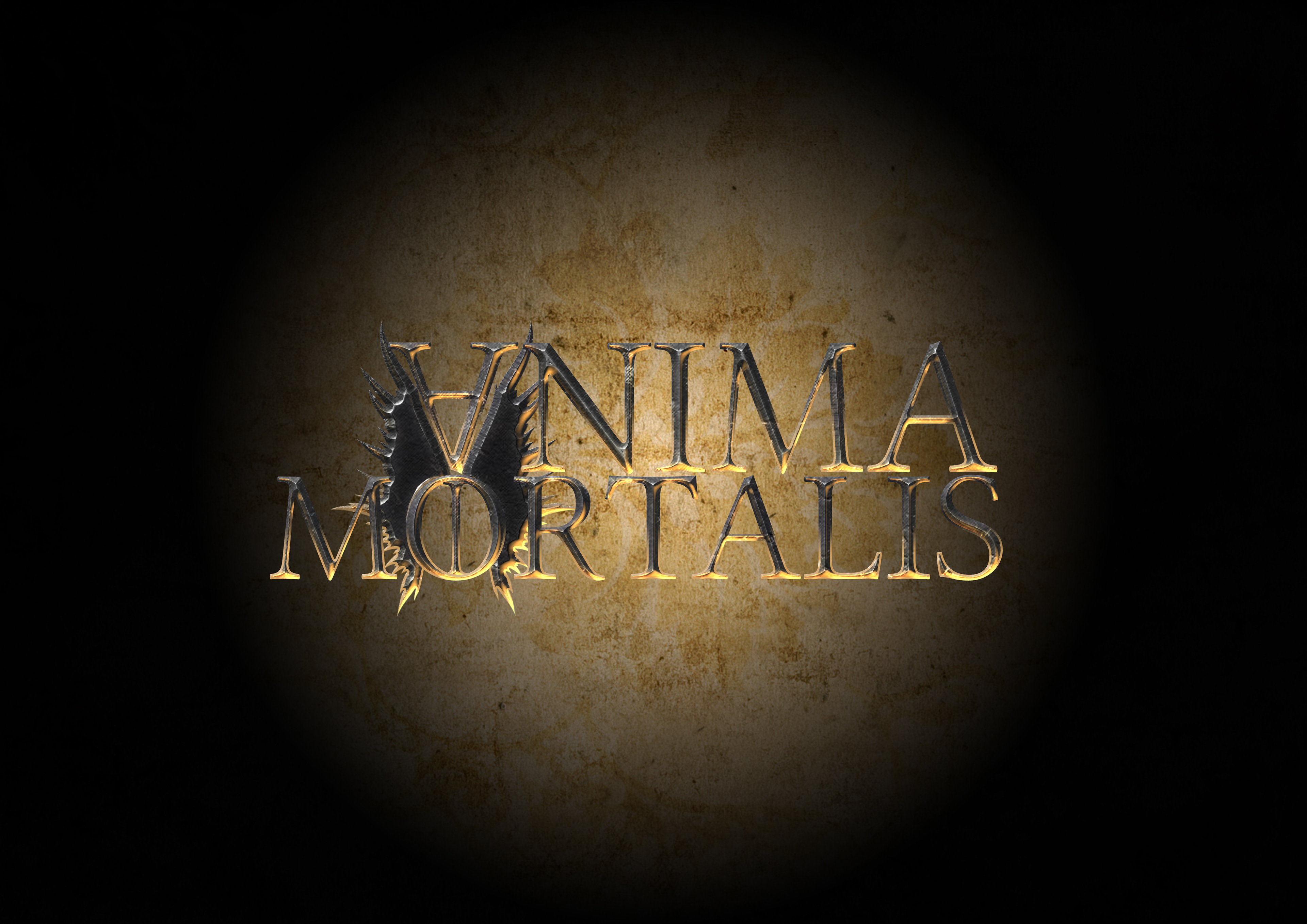
Version VII
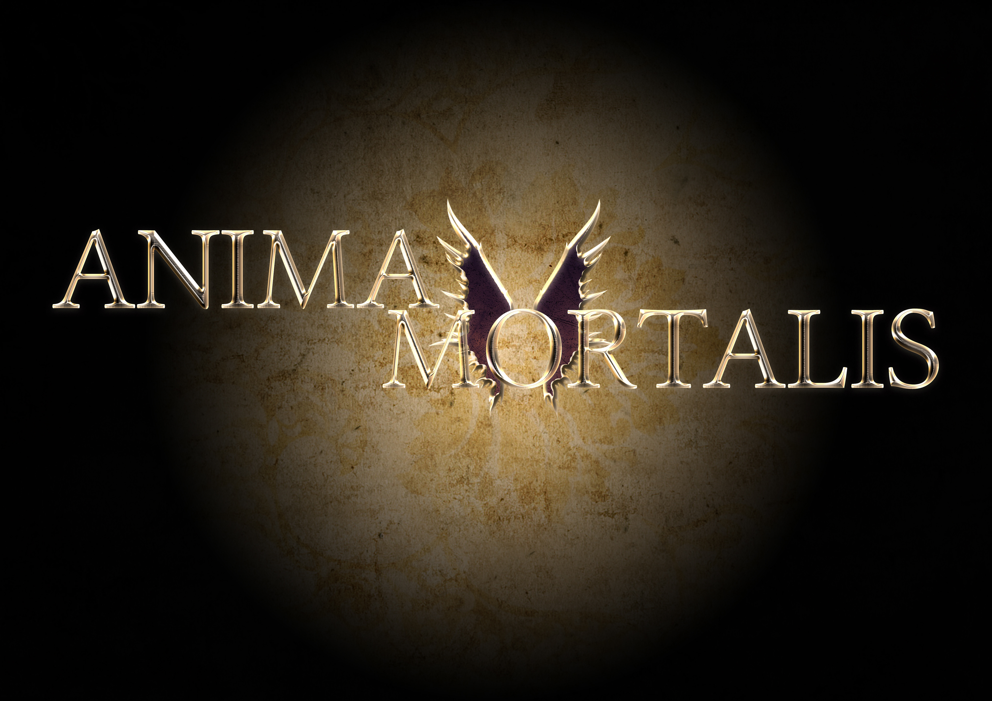
Version VIII
I liked the idea of the "I" in the logo, right between the angels, standing for man, mankind and do not forget the snake/dragon/devil's Tail on the S.